Breakfast
project duration: march - july 2022
Breakfast is a resource app that helps foreigners familiarize themselves with traditional Taiwanese breakfast and Taiwanese culture and learn Mandarin through the lens of Taiwanese breakfast shops.
The problem:

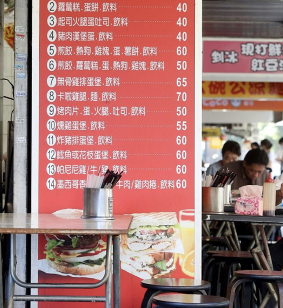
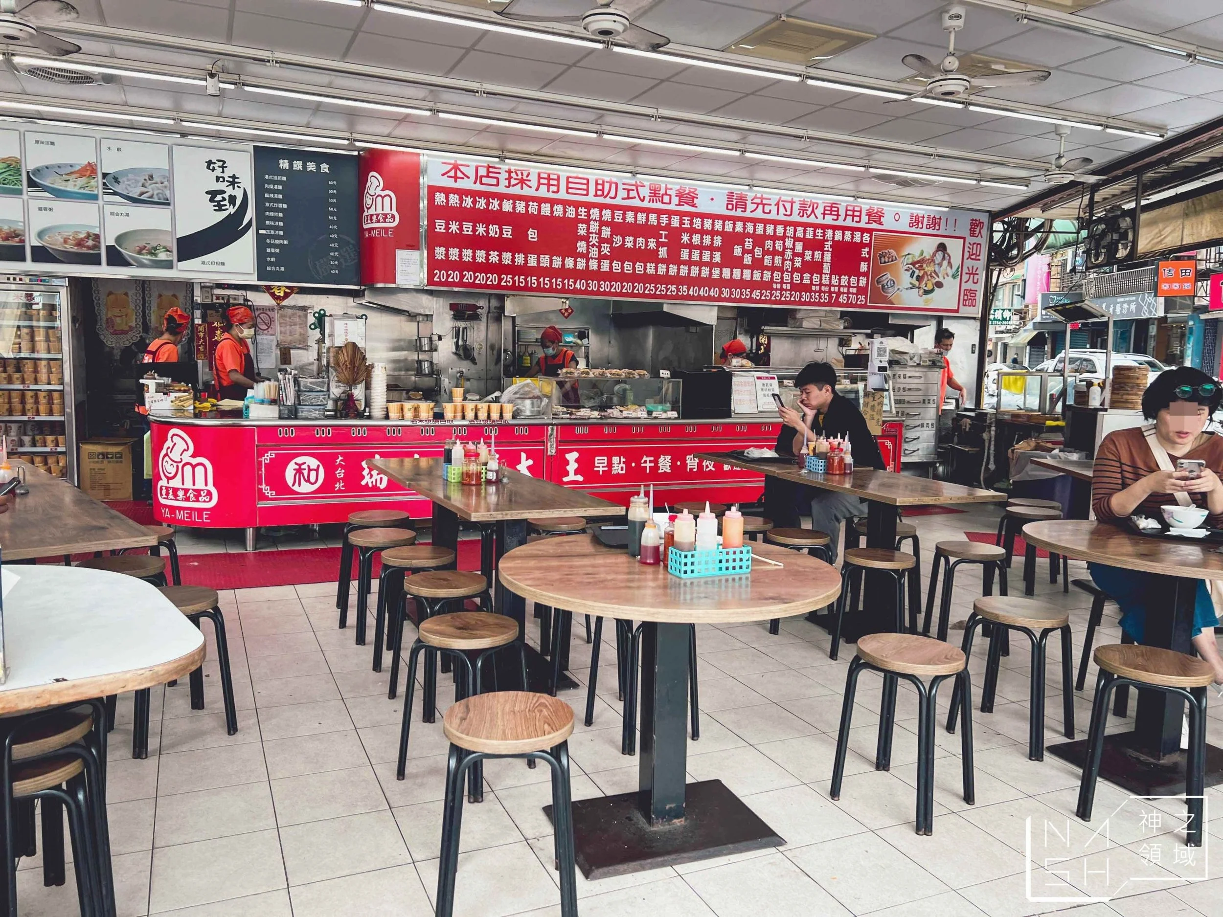
Traditional Taiwanese breakfast shops are a staple to Taiwanese culture, but the experience is often inaccessible to foreigners. Many traditional breakfast shops are not listed on maps and have no online presence. Breakfast shop menus are vast walls of Chinese characters, with no images to indicate what an item could be.
The goal:

Design an app that acts as a one-stop resource for traditional Taiwanese breakfast shops.

My role: UX designer, designing Breakfast from conception to delivery.
Responsibilities: Conducting interviews, paper and digital wireframing, low and high-fidelity prototyping, conducting usability studies, accounting for accessibility, and iterating on designs.
user research
user research
I conducted interviews and created empathy maps to understand the users I’m designing for and their needs. A primary user group identified through research was young professionals living in Taiwan.
User research studies found that this user group is often preoccupied with work, lacking substantial free time that is needed to properly study a language, and therefore has little to no Chinese skills.
Pain points:
Foreigners with inadequate Mandarin language skills find it difficult or impossible to read menus at traditional Taiwanese breakfast shops.

Traditional Taiwanese breakfast shop owners and staff are typically elderly, lacking English language skills. Being forced to use English with a foreigner is uncomfortable and causes them stress.

Foreigners feel embarrassed when making language mistakes, causing them to avoid ordering food in Chinese, or stop seeking out cultural experiences altogether.


User journey:

wireframes
wireframes
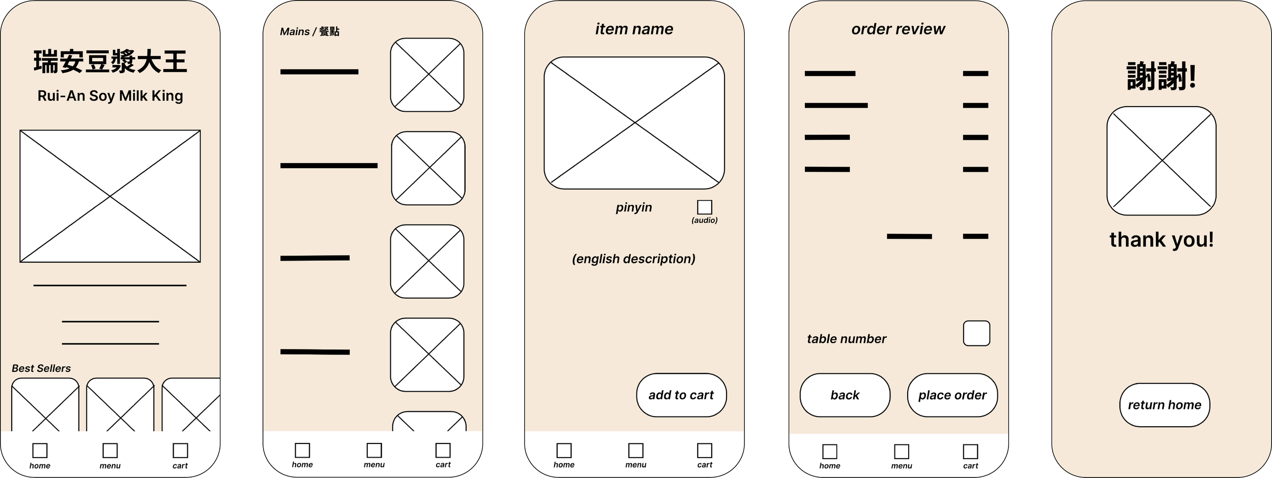
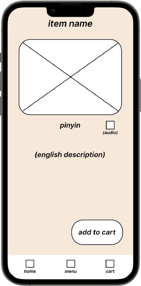
Low-fidelity prototype:
Preparing my app for the initial usability study, I connected each page in the primary user flow of browsing the menu, learning about a menu item, and placing an order.

Usability study findings:
1
Users feel the order placement feature is not relevant; prefer app as a resource
2
copy and gestures need improvement
3
Users want more features that educate about the cultural significance of breakfast shops
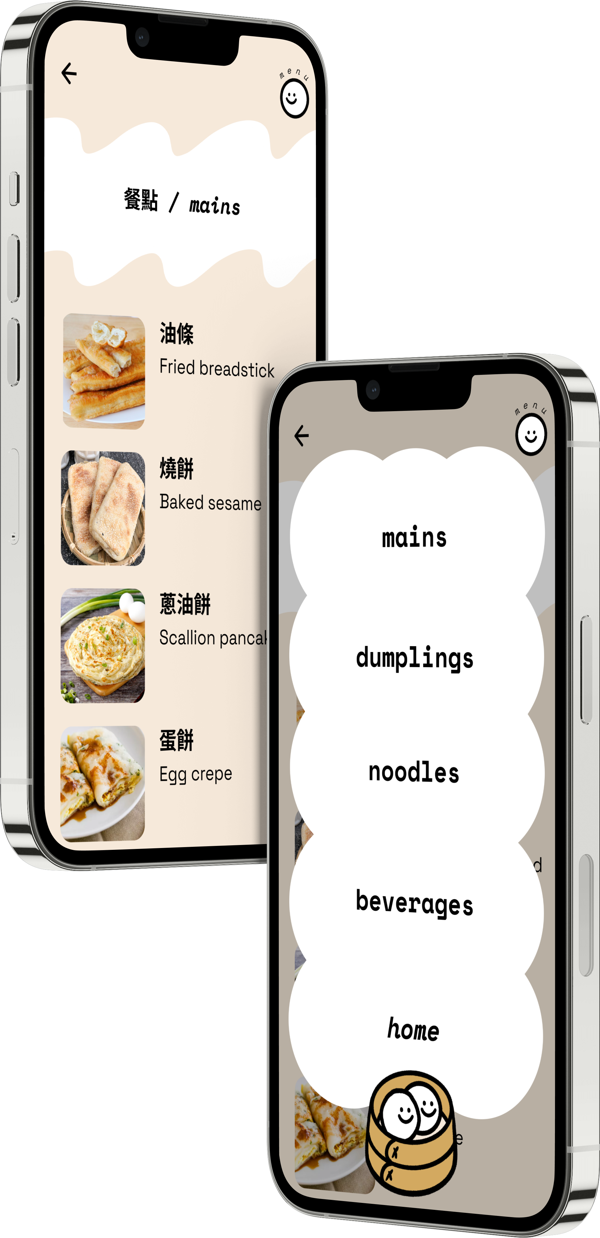
Mockups:
The original low-fi prototype revolved around order placement, which is reflected in the navigational bottom tab. Usability studies showed that users did not find order placement to be a relevant feature, so the structure of the app needed to be changed.

The app was originally intended to cater only to one specific breakfast shop, which was replaced to simply “Breakfast”
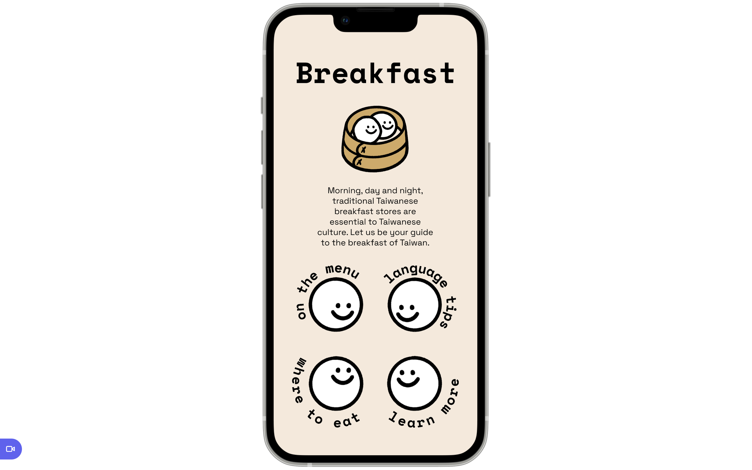
I opted to remove the bottom tab to favor the homepage as a navigational hub for the app.
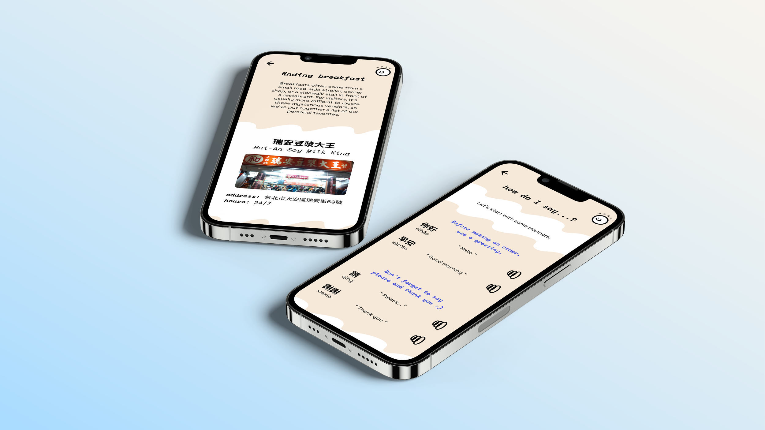
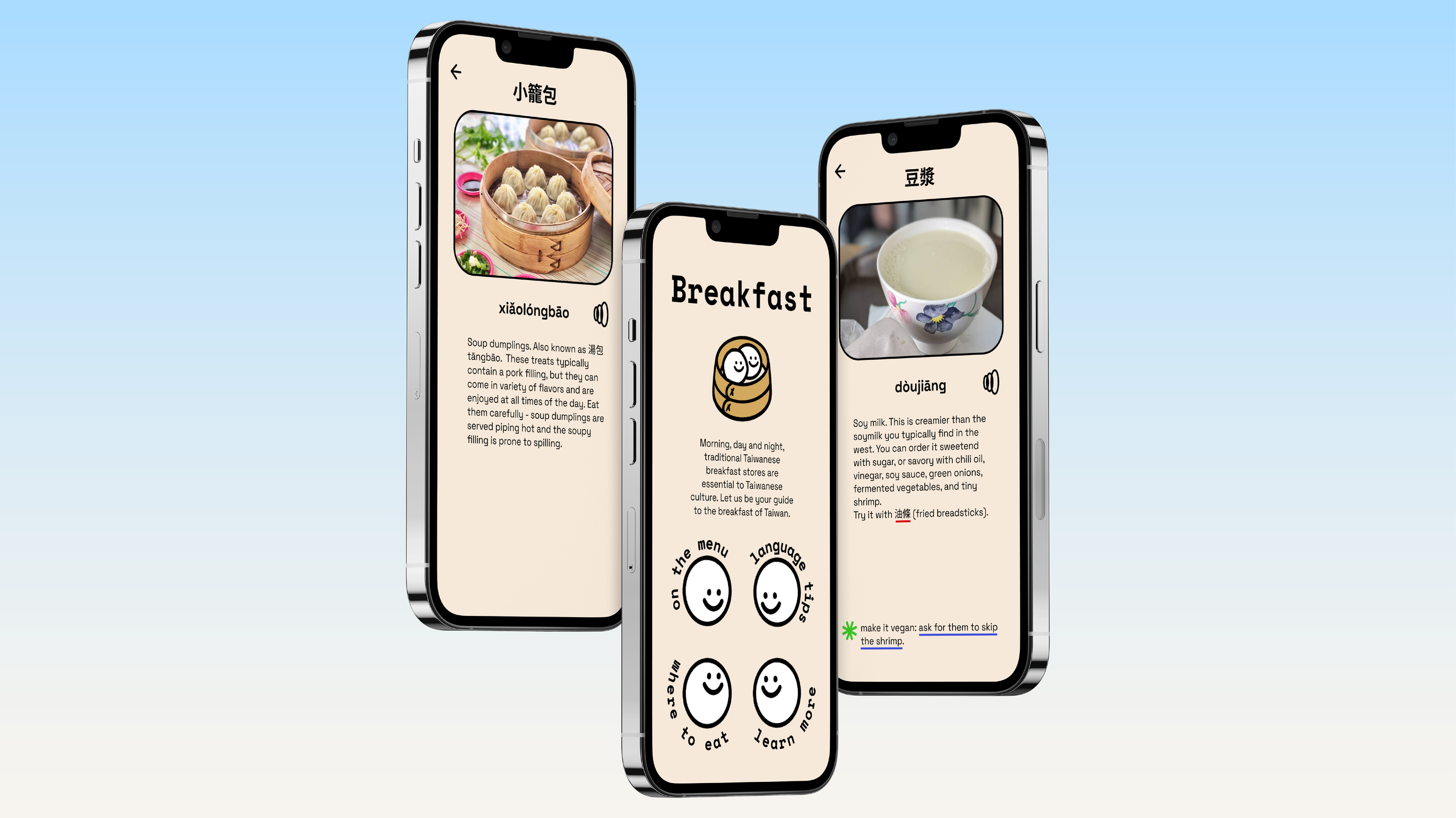
Taiwanese breakfast shops offer foods that are highly customizable, so users wanted suggestions for customizing their orders. When I shifted my focus from “order placement app” to “resource app”, I decided that the best way to include such a feature was to teach the user how to make a customized order in Chinese.
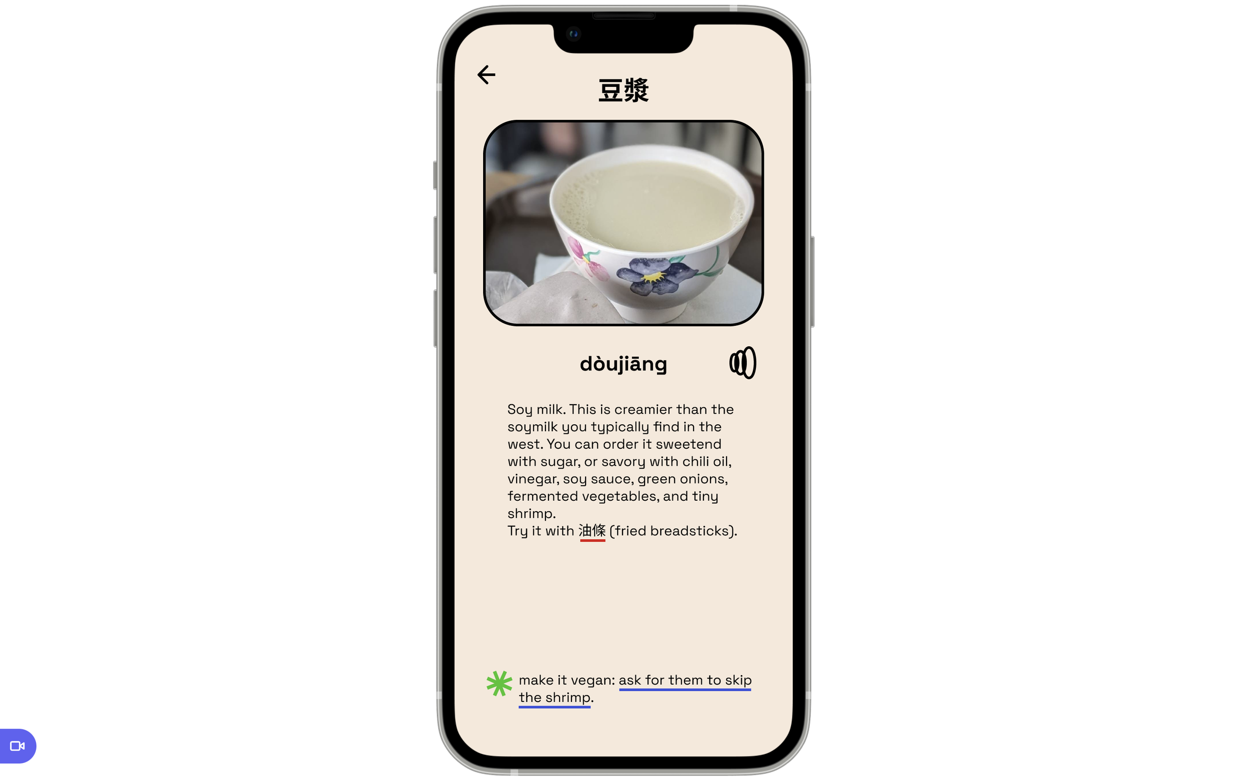
The English description has suggestions for order customizations and toppings written in that link directly to the language page and relevant section.
Each section of the app contains an overlay menu, which can be opened by tapping the smiling dumpling in the upper right corner. When opened, the smiling dumpling turns to face the user.
The overlay is meant to be a cloud of steam, such as the ones that can be seen at Taiwanese breakfast shops.